Project Overview
A design system is a set of components and rules that define and organize the elements and visuals of a product. This created structure accelerates the design process by putting every element in order.
This design system was created in 2022 to organize and support the creation process of the Biosignals application, a desktop and mobile app used to acquire, read and analyse biosignals both from PLUX and third party devices.
The benefits
- Makes the design process faster, more organized and easier
- Helps users master the UI faster, creating a more cohesive experience
- It serves as a future-friendly foundation so changes or tweaks can be made easily in the future
Colours and Grids

In this project, the primary colours are shades of blue representing the brand. To optimize for light and dark modes, we chose different blues as primary hues. We created a straightforward neutral palette as the design's base and a distinct set of colours for interaction states like danger, warning, and confirmation. These colors were selected for their visual appeal and effective communication.

In the initial stages of planning, three primary grid structures were meticulously defined. These grid structures were specifically tailored to accommodate the three different types of devices that were intended to be utilised, namely tablets, smartphones, and computers. This careful categorisation was done to ensure optimal user experience across all platforms, taking into account the unique characteristics and capabilities of each device type.
Buttons


For this Design System I decided to use a limited number of buttons to avoid having too much components.The primary distinction is between light and dark mode buttons, as well as the danger button. Secondary buttons were also created for better hierarchy control.

Input fields

The goal for inputs and most other components was to create a simple, clean design. This design system is intended for use across multiple products, so simplicity is crucial. It aids in integrating everything into various projects, while leaving room for differentiation with other design elements.
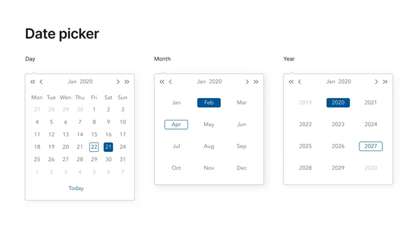
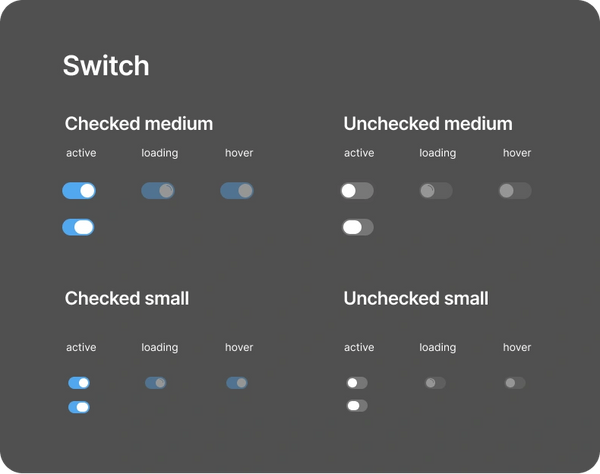
Date pickers and switches


Alert messages

Our interface's alerts follow the color palette rules. They can be used for various purposes, like error messages for failed logins or size-restricted file uploads. Alert messages can also confirm successful actions like form submissions or saved settings, keeping the user informed.
Tooltips and Radio

Tooltips are primarily used to reduce on-screen information, providing additional details about specific terms or points. Size can change depending on the text amount.

Radios, just like checkboxes, can be used to select an answer on a form, for example. The difference is that a radio button only allows the user to choose one option.
Thank you!
Copyright © 2024 Victor Goulart Tavares - All Rights Reserved.